NuxusEd Mobile — Parent, Student & Teacher App
The Flutter app for the NuxusEd school platform, on Android and iOS: one codebase and one entry point serving three genuinely different products — a parent portal, a student portal and a teacher portal.
Case study
How this was built, in the order I'd walk someone through it.
- 01
Problem
School software is written for administrators sitting at desks, and then handed to parents and teachers who are neither. A parent wants one question answered — is anything wrong with my child this week — usually while doing something else. A teacher needs to mark a register during roll call, not after. Neither will open a desktop portal to do it.
- 02
Users
ParentsStudentsTeachers - 03
Architecture
A single Flutter codebase for Android and iOS, authenticating against the same NestJS API as the web portals, with the role on the credential deciding which of the three products the user gets after sign-in.
- 04
My responsibility
Built the app — the role-based entry flow, the parent portal and the teacher portal — against the backend I also worked on.
- 05
One important feature
One entry point, three information architectures
Parent, student and teacher sign in through the same screen and land in what are effectively three different apps. Nothing is a permission-toggled variant of a shared dashboard: the parent's home leads with what needs attention across their children, while the teacher's leads with today's timetable and what's waiting on them.
- 06
How it works internally
The parent flow treats multi-child households as the default rather than an edge case — a child picker sits between sign-in and the dashboard and stays switchable from the home screen, so all downstream data is scoped to the selected child. Attendance marking is built for speed under time pressure: section tabs across the top, five statuses per student, a Mark all shortcut for the common case, and auto-save as you go so a teacher interrupted mid-register loses nothing. Homework publishing carries live submission counts per section, which turns the list into a progress view rather than an archive.
- 07
Challenge
Serving three roles from one codebase invites the easy mistake: build one dashboard and hide the parts each role shouldn't see. That produces an app that fits nobody, because the shape of the information is wrong for two out of three users, not just the quantity of it.
- 08
How I solved it
I let the three portals diverge in structure and share only what genuinely is shared — auth, networking, theming, and the domain models. The cost is more UI code; the benefit is that a parent's home screen can lead with a fee due and a teacher's with an empty class slot, which is what each actually opened the app to find out.
Screens
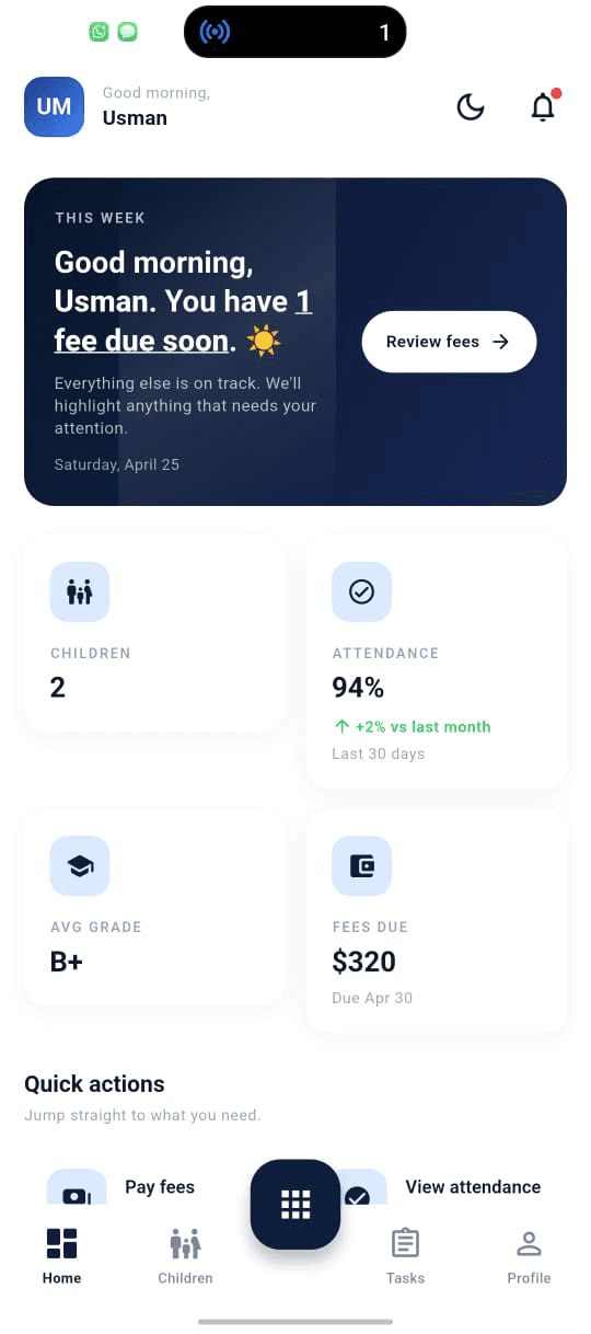
Parent home
Leads with what needs attention — a fee due soon — then attendance, average grade and balance. Written to be read in ten seconds.
Parent — select a child
Multi-child households are the default case. The picker sits between sign-in and the dashboard and stays switchable from home.
Teacher dashboard
Today's schedule as the spine, plus pending leave approvals. Same app, same auth, completely different information architecture.
Attendance marking
Section tabs, five statuses per student, a Mark all shortcut and auto-save while you work — designed to be finished during roll call, not after it.
Homework publishing
Published tasks with due-date urgency and live submission counts per section, so a teacher sees at a glance which class is behind.